Never stretch the mark, redraw its curves, alter its relationship to the wordmark or invent a second favicon.
DYSONX VILOGO CONCEPT
VISUAL IDENTITY / APPROVED DIRECTION / 2026A unified intelligence
for the physical world.
AI · WORLD MODELS · PHYSICAL AI · AGI
PRIMARY LOGO

SYMBOL

USAGE EXAMPLES

FAVICON
 16 × 1632 × 3264 × 64128 × 128
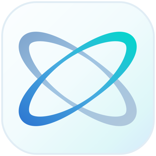
APP ICON (SAMPLE)
BRAND PALETTE
#415466
#6E8AA7
#D6E4EF
#E8F7FB
#6EE7F3
DESIGN REFERENCE · LIGHT, PRECISE & CONNECTEDEXPLORE FULL BRAND SYSTEM ↓
01 / The idea
Less noise.
More intelligence.
Intelligence is becoming part of everything. The DYSONX identity meets that moment with an open, connected symbol and a calm visual system made to last.
The twin orbits speak to different worlds coming together: computation and reality, knowledge and discovery, technology and people. No visual excess — just a quiet signal of what comes next.
01 / CLEAR
Clarity by design
Purposeful shapes, meaningful space and information that is easy to understand.
02 / CONNECTED
One continuous system
A visual language that travels naturally between products, interfaces and ideas.
03 / OPEN
Room for discovery
Lightness and motion hint at possibility without becoming a sci-fi spectacle.
02 / Identity
Two paths.
One expression.
Two symmetric orbital paths with sculpted ends and a finely drawn center form a distinctive, scalable mark of connection. Together with a quietly confident wordmark, they establish a simple, versatile signature.
Primary logo / light field
Standalone symbol / transparentA single mark for multiple scales
A single mark for multiple scales01 / PROPORTIONKeep it original
Never redraw, rotate, distort or stretch the two orbit paths.
02 / SPACINGGive it room
Minimum clear space: 20% of the mark width around every logo.
03 / SCALEDesigned to travel
Use the dedicated favicon at tiny sizes; use the signature from 180px width.
03 / Icon family
One small symbol.
Everywhere.
From the browser tab to an app launcher, the identity remains light, distinct and recognizable.
BROWSER / FAVICON
Recognition at a glance.
The approved twin-orbit mark alone: no background, tile, frame or shadow at any size.
163264128APPLICATION / ICON MASTER
Quietly recognizable.
A soft-glass app treatment, keeping the underlying orbital mark intact.
Download app icon SVG ↓04 / The palette
A lighter
kind of future.
Gentle neutrals are the foundation. Soft blue and luminous cyan are supporting signals, not distractions.
Slate
#415466
Soft Blue
#6E8AA7
Silver
#D6E4EF
Soft Glow
#E8F7FB
Cyan
#6EE7F3
Usage rule: pair high-contrast Slate or Ink with pale surfaces for readable text. Cyan is a decorative accent or indicator — never a small paragraph color on white.
05 / Typography
Every word.
Well considered.
Contemporary geometric sans-serif letterforms, precise spacing and a calm, highly readable hierarchy.
01 / DISPLAY · MODERN GROTESK
AaXx
Intelligence begins
with understanding.
with understanding.
Inter / Helvetica Neue / ArialDisplay · 500
02 / BODY + TECHNICAL
A clear and adaptable system for products, research, and the ideas that connect artificial intelligence to the world around us.
AI / AGI / WORLD MODELS
PHYSICAL INTELLIGENCE
0123456789 · 2026
Readable · consistent · scalableBody · 400
06 / Visual language
Structure,
with breathing room.
A few thoughtful elements — paths, nodes and translucent layers — convey connected intelligence without visual clutter.
CONCEPT A / CONNECTED PATHS
One flow, many possibilities.
Thin continuity lines reveal intelligent connection while preserving space.
FIG / VI–FLOW–01CONCEPT B / INTELLIGENCE FIELD
Precise, yet open.
Quiet spatial structures hint at world models and adaptive systems.
FIG / VI–FIELD–0207 / In application
From interface
to everyday use.
The same gentle language extends across a website, product experience and physical brand touchpoints.
DIGITAL / WEBSITE SYSTEM · ILLUSTRATIVEExplore · Research · ContactThe future is
dysonx.com
Explore · Research · ContactA new era of connection
The future is
more intuitive.
An intentional interface feels calm, clear and instantly recognizable.
PRINT / BUSINESS CARD · ILLUSTRATIVE
First LastYour role
contact@example.com
contact@example.com
Example layout only. Personal details are intentionally placeholders.
08 / Usage principles
The discipline
behind simplicity.
Consistency is not more decoration. It is knowing what to leave out.
Use solid titles, readable contrast and enough whitespace. Avoid outlined lettering and gradients inside body text.
No heavy black cosmic canvases, exaggerated glow, unrelated particles or visually distracting animation.
09 / Source assets
One identity.
Ready to build with.
Original transparent SVG marks, scalable favicon and app icon, canonical CSS tokens, and the written identity rules.
Primary symbolSVG · TRANSPARENT
Wordmark · darkSVG · ON LIGHT
Wordmark · lightSVG · ON DARK
Favicon masterSVG · SMALL-SIZE MARK
App icon masterSVG · SQUARE
Color tokensCSS · COLOR + TYPE TOKENS
Brand guidelinesMARKDOWN · DESIGN RULES
Vector-first master system. PNG, ICO and print production exports can be rendered from these sources when needed; they are not represented as included downloads here. The earlier /VI/ identity is preserved independently.